Choosing paint colors is the step that paralyzes homeowners more than any other. We've had clients pick a contractor, sign the contract, order the paint, and then call the night before we start with a panic attack about whether 'Accessible Beige' is too warm. After 25 years of painting Central Ohio homes — from Victorian farmhouses in Lancaster to glass-and-steel new builds in New Albany — we've developed a process that takes the guesswork out of color.
The trick is to stop thinking of color choice as a Pinterest exercise and start treating it like a system. Your home's architecture, its fixed materials, the neighborhood context, and Ohio's particular quality of light all put real constraints on what will actually look great once it's on the house. Follow those constraints and the right colors practically pick themselves. This guide walks you through the exact steps we use with clients in Fairfield, Franklin, and Licking counties.
Start With Your Home's Architecture
The single biggest mistake Central Ohio homeowners make is picking a color that fights the architecture. A 1910 Victorian in Lancaster with gingerbread trim wants a historically-grounded three-color scheme — body, trim, accent. A mid-century ranch in Reynoldsburg looks best in a warm, low-contrast monochrome. A 2005 Pickerington colonial works with a classic medium-value body and crisp white trim. A modern farmhouse build in Pataskala leans into the high-contrast white-body, black-trim look.
Before you pull a single chip, figure out what your house is architecturally. Once you know that, half the 'too many choices' problem goes away because entire color families rule themselves out.
2026 Exterior Color Trends for Central Ohio
We pulled color data from our own 2025 jobs and what paint reps are pushing for 2026. These are the palettes actually being specified in Fairfield, Franklin, and Licking county homes right now:
- Warm neutrals — think 'Accessible Beige', 'Agreeable Gray', 'Edgecomb Gray' replacing the cool grays of 2015–2020
- Deep forest and sage greens — especially on shutters, doors, and craftsman-era homes
- Soft blacks — 'Tricorn Black', 'Iron Ore' on trim and window sashes for modern farmhouses
- Earthy terracotta and muted rust — showing up on doors and brick-home accent trim
- Classic white with true black trim — the farmhouse look that still isn't going anywhere
- Creamy off-whites — 'White Dove', 'Alabaster' for traditional colonials and cottages
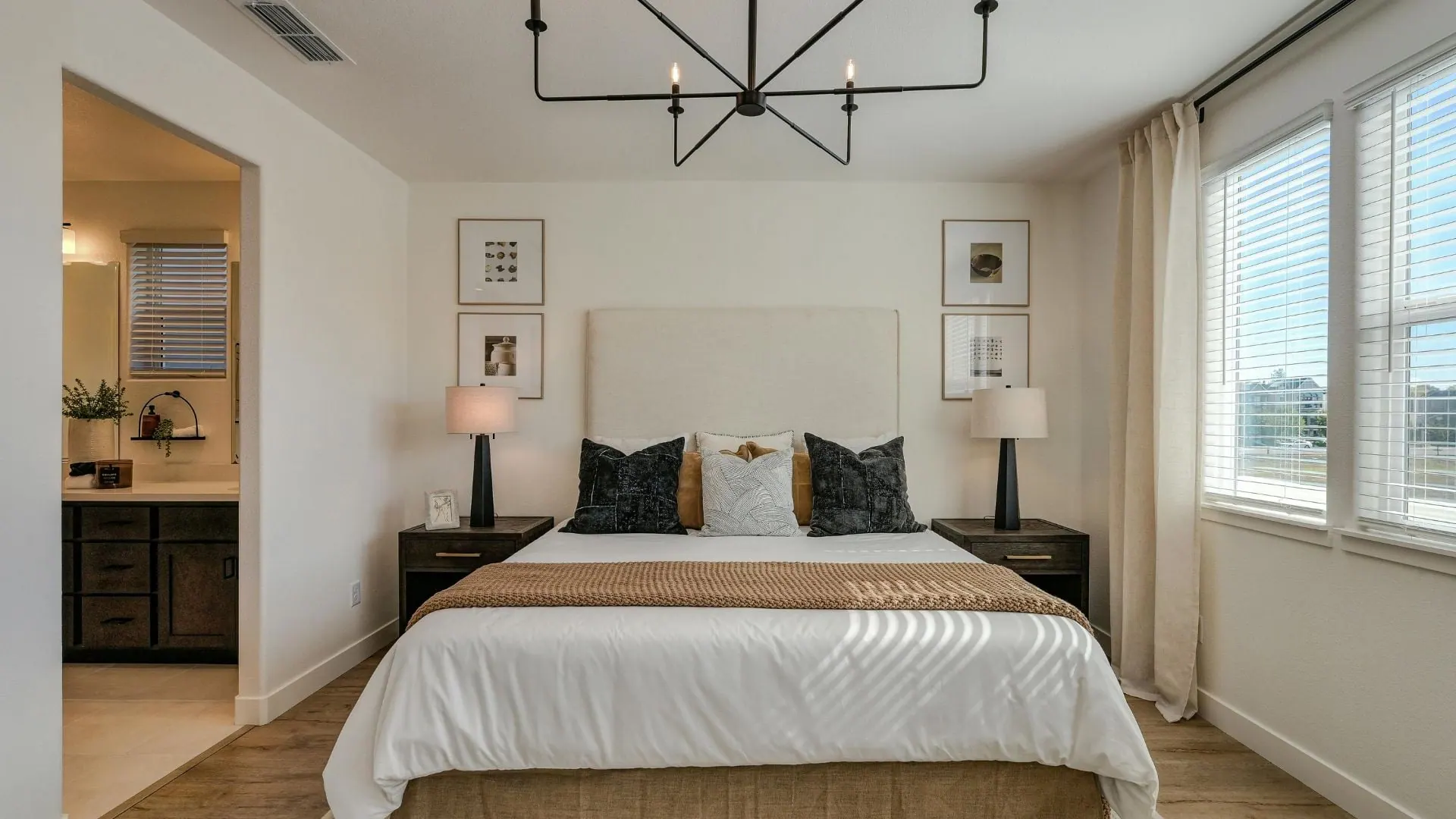
The Psychology of Interior Color
Color affects how a room feels before anyone consciously reads it. We've watched homeowners walk into their own freshly-painted bedroom and visibly exhale because a warm cream replaced an institutional gray. Here's the short version of what each color family does:
| Color | Mood / Effect |
|---|---|
| Blue | Calm, restful — strong in bedrooms and bathrooms |
| Green | Balanced, grounding — works almost anywhere |
| Yellow | Energetic, bright — kitchens and breakfast rooms |
| Gray | Neutral, modern — cool grays feel crisp, warm grays feel cozy |
| Warm white | Inviting, timeless — living rooms, hallways |
| Charcoal | Sophisticated, dramatic — dining rooms, studies |
| Terracotta | Grounded, earthy — kitchens, mudrooms |
| Navy | Classic, confident — libraries, kids' rooms, accent walls |
Coordinate With Fixed Elements
Your paint is the easy thing to change. Flooring, countertops, cabinets, roof shingles, and brick or stone aren't. Always pull your color direction from the most permanent elements in the room or on the house.
On the exterior, your roof color dictates warm vs cool body paint. A brown asphalt roof leans toward warm beiges and tans; a gray architectural roof leans cool. Brick is non-negotiable — pick a trim color that lives in the same undertone family as the brick mortar, not the brick itself. Inside, pull wall color from the least-dominant tone in the flooring or countertop; that's how rooms feel cohesive instead of matchy.
How to Test Paint Colors the Right Way
Tiny 2x2 inch paint chips are useless. Ohio's low winter light and high summer UV completely change how a color reads between January and July. Here's our testing protocol:
- Buy sample pots or peel-and-stick large samples (12x12 inches minimum)
- Paint swatches on at least three walls per room — different light exposures read differently
- For exteriors, paint a 2x2 foot section on the actual siding, not a board
- Look at the samples in morning light, midday light, and evening light
- Look at them under the artificial light you actually use at night
- Live with the samples for at least 48 hours — first impressions lie
- Hold fixed element samples (cabinet door, flooring scrap) next to the wall color
Accent Walls and When to Use Them
Accent walls aren't as fashionable as they were in 2015, but they still work when done right. Here's our rule-of-thumb list:
- Do: Use an accent wall to anchor a natural focal point — fireplace, headboard wall, built-in bookcase
- Do: Keep the accent 2–3 shades darker than the main wall color, or a coordinating deeper hue
- Do: Use in rooms where seating naturally faces the accent wall
- Don't: Paint the wall with the door or window as your accent — it fragments the room
- Don't: Pick a color that's more than one 'step' away from your main palette
- Don't: Accent-wall every room in the house — it loses impact
Colors for Small Rooms
Ohio housing has plenty of small bedrooms, half-baths, and galley kitchens. Contrary to the myth, 'white makes it bigger' isn't always true — a dark, saturated color can actually make a small room feel intentional and cozy instead of cramped. For small rooms that feel cramped, our preferred moves are light cool colors on walls, flat bright white on the ceiling, and wall-color-matching trim to eliminate visual breaks. For small rooms you want to feel rich and intentional, commit — go deep navy, hunter green, or charcoal on all four walls and the ceiling.
Historic Home Paint Color Considerations
If you own a home in downtown Lancaster, Granville, Newark's historic district, or any of the older Victorian pockets around Central Ohio, color choices may be regulated. Many historic districts have approved color palettes based on era and architectural style, and repainting in non-approved colors can trigger fines and forced repaints.
Before you pick colors on a historic-district home, contact your local historic preservation office. Lancaster's Fairfield Heritage District, for example, maintains an approved palette. Sherwin-Williams and Benjamin Moore both publish 'historic color collections' that align with most district rules, which makes the process much easier.
Our Favorite Central Ohio Paint Palettes
These are five palettes we've used on dozens of Central Ohio homes with consistently great results:
- Lancaster Historic: Warm gray body + cream trim + hunter green accent (shutters, front door)
- Pickerington Classic: Agreeable Gray body + Pure White trim + Tricorn Black front door
- Granville Colonial: Alabaster body + black trim + brass and natural wood accents
- New Albany Modern Farmhouse: White Dove body + Iron Ore trim + stained cedar front door
- Reynoldsburg Craftsman: Sage green body + creamy white trim + deep burgundy door
Common Color Mistakes to Avoid
- Picking exterior colors from chips held in your living room — hold them outside against the house
- Ignoring undertones — a 'gray' with pink undertones will clash with warm brick
- Using 5+ colors on one house exterior — 3 is the limit for most Ohio architecture
- Matching trim color exactly to window vinyl — a subtle contrast reads better
- Forgetting that colors look 30% more saturated on a full wall than on a chip
- Not sampling — online visualizers miss undertones completely
Free Color Consultation With Your Quote
Every Scott's Painting estimate includes color guidance. We've specified thousands of Central Ohio palettes and can save you three weekends of Pinterest scrolling. Call (614) 809-9730 to schedule a walk-through.